There are a few ways to make panoramic images: using a panoramic camera that captures your scene in one image, stitching together a series of pictures, or cropping a single image to a panoramic aspect ratio. Which method you use doesn’t matter, but aspect ratio does.
Panoramas work by forcing the viewer’s eye to see things differently. Our eyes naturally see in about the same width to height ratio as a 35mm sensor, 3:2. Panoramas force us to deal with skinnier than usual frames, sometimes extremely skinny. This changes how we perceive what’s happening in the photograph.
If an image is technically competent and successfully exploits that difference in perception, it’s a good pano. If it doesn’t, it’s a bad pano. Now let me try to explain how this works…
There is no single definition of a panorama, but I’m going to use an aspect ratio of 2:1 or greater for an operational definition. An image 10” x 5” is 2:1. 10x 4 would be 2.5 to 1, and 10 x 3 would be 3.3:1. Panoramas may be either vertical or horizontal, though vertical panos are far less common than horizontals.
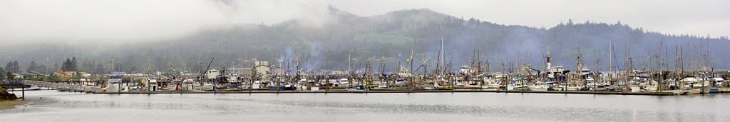
Generally speaking, panoramas wider than 3.5 to 1 start incurring a penalty: you have to print them large enough for the details to be plainly visible. If you print a 4:1 pano to one foot wide, it will only be three inches tall. You’d have to print the thing four feet wide to have an image one foot tall. Nothing wrong with that, but it is a limitation. Figure 1 below provides an example. The 6:1 pano below starts looking really good at 6’ wide – too wide for most situations. You might get something useful at 4’ wide (8” tall), but … MEH.
 |
|
Neah Bay Harbor WA,6:1, 8 shots stitched. (Click to view larger image)
|
So why bother with panoramic shots? What makes panoramas special? The effects of aspect ratio for one- the wider the aspect ratio, the more we are forced to “read” the image, rather than take it in, in one large visual gulp. Panos also have two other main effects: they isolate the subject, or they lead the eye (sometimes both). I’m going to give a few examples to make these rather vague generalizations somewhat clearer.
 |
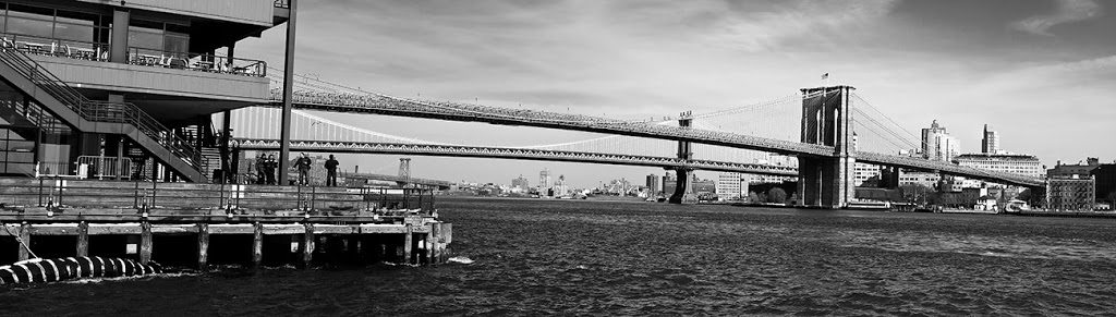
|
Brooklyn Bridge., 3.5:1. (Click to view larger image)
|
This image
(above) was stitched from 7 separate pictures, hand held. It tells the story of crossing the East River, and it works in two ways. First, the vertical compression (skinniness) forces us to stay focused on the bridge. Second, the opposing masses of South Street Museum and the distant column counterbalance each other, yet they are connected by the shallow arcs of the bridge deck. This is “leading the eye”. The panoramic form helps us to see the relationship between foreground and background and certainly reinforces the story being told.
 |
|
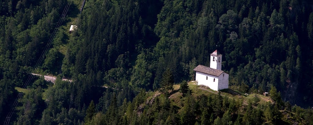
Alpine Chapel, 2.5:1. (Click to view larger image)
|
This pano (above) is cropped from a 48 megapixel RAW file. The panoramic format limits the eye’s ability to range vertically, while the dark negative space contrasts with the white chapel, brightest object in the frame, which is positioned according to the Rule of Thirds. In this instance, the story of the picture has to do with the importance of religion in this isolated place, and with the question of how they get there – Snowmobiles? Helicopters?
 |
|
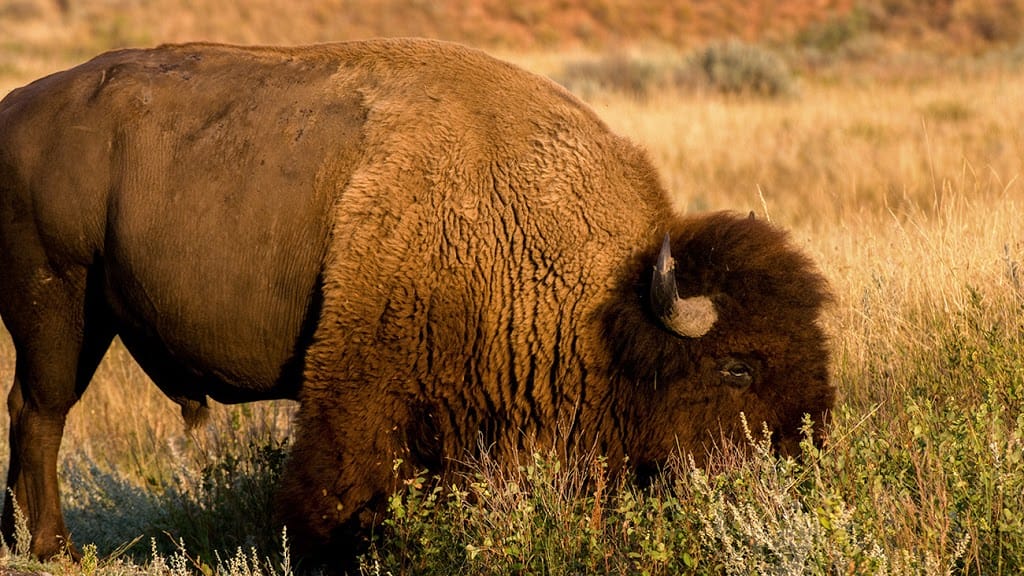
North Dakota Bison, 2:1.
|
This is not a particularly good panorama (above), because the panoramic format doesn’t enhance the image. The aspect ratio isn’t reinforcing the composition, and the depth of field is already blurring the background, so there’s not much gained by removing background by cropping out the vertical dimension. The bison needs room to range! There’s nothing wrong with the shot, it just doesn’t benefit from the panoramic format.
 |
|
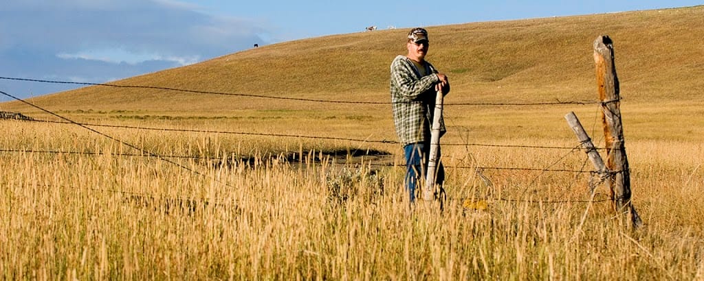
Wyoming Rancher, 2:1.
|
In this shot, what’s been cropped is mostly sky (who needs it?), and while this is “Big Sky” country, it’s not needed to give you the sense of open range. The huge depth of field (the rancher and the horses on the ridge are both in focus) tells us all we need to know about the vastness of this space. This shot was a crop, not a stitch.
 |
|
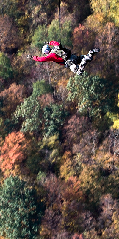
Base Jumper, 2:1 vertical pano.
|
In this pano (above), the constricted space is left-right, leading our eye down past the jumper to his highly doubtful landing space. There is no escape! A real story picture. Cropped full-frame image.
Having looked at a sample set of panoramas, it’s time for some generalizations about the difference between “good” and “bad” ones…
Characteristics of Good Panos
- Good panos use the wide aspect ratio to constrain our vision – and that has to be done for some positive reason, like improving the story-telling or the impact, or the composition of the image.
- Good panos move from some place, to some place. Alternatively, they focus on a specific subject.
- Good panos don’t make subjects feel cramped when they shouldn’t be (as in Figure 3). But they do limit surrounding space — if that’s used well, good pano, if not, bad pano.
- Good panos, like any good photo, tell a good story.
- The panoramic format helps the viewer concentrate on what’s important in the image, by limiting distractions and helping the eye go where you want it to.
- The basic structure of the image is horizontal (or vertical for vertical panos). Horizontal shapes, horizontal lines, stripes, striations, and patterns all work in horizontal panos.
Characteristics of Bad Panos
-
A basically vertical subject is squished into a strongly horizontal frame. NEVER try to force vertical subjects or stories into a horizontal pano.
-
It’s one thing to use aspect ratio to constrict the eye’s tendency to roam, and another to squeeze things so tight the subject is camped.
-
Eliminating context, background, and negative space to no purpose.
-
Just because an image is 2:1 or wider, doesn’t automatically make it a good example of a panoramic image, as in the example below…
 |
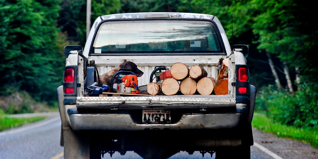
| Washington pick-em-up truck, 2:1. |
The above image doesn’t take advantage of the panoramic aspect ratio. The centered composition and square truck just don’t add up to an effective panorama.
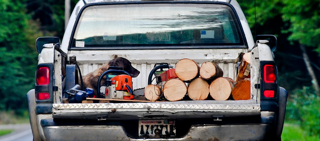
You can even re-edit the same image like in the example below, which has a 2.5 to 1 aspect ratio and concentrates more on the rectangular truck bed, but it still doesn’t work as a panoramic.
 |
| 2.5:1 Still not a pano. |
If you follow the guidelines above, you’ll get reliable results. But best of all, learn to see potential panos when you frame the shot in the first place!
Contributor Bio:
Eric K. Hatch focuses on travel and fine art photography, and is an expert in digital photo restoration. Panoramas are currently one of his favorite photographic forms. He has won numerous regional awards and a number of competitions. His work has appeared in several AAA magazines, Oxygen Magazine, Bicycling, Alaska Milepost (annual) and Wooden Boat, to name a few. He has served on the board of the Southwest Ohio Professional Photographers Association, an affiliate of the Professional Photographers of America.
Eric has also written over 70 articles, essays, speeches, features, and professional articles in the last 30 years. His work has won two national awards: a Gold Quill from the International Association of Business Communicators, and Communicator of the Year from the Aviation/Space Writers Association.
In his youth, Eric studied under Guido Organschi, and later under Skip Schiel. He is the author of Explorations in Photography, Adventures and Advice for Advanced Amateur Photographers, which was recently released.
Explorations in Photography is an entertaining and informative how-to for advanced amateur photographers. The book covers artistic issues, explains some fundamental technical issues, and provides many hints from buying equipment to editing your photos. It also covers taking people pictures outdoors, handling nasty lighting situations, and includes a bonus chapter discussing photo restoration. Find it on Amazon here.
Websites:
General Portfolio- http://ekhphoto.smugmug.com
Photo restoration- http://www.hatchphotofix.com